apphour
Speed networking for virtual events. An iOS app for an early-stage startup in San Carlos, California, that had several competing ideas and no fixed direction.
- Project
- Speed networking, iOS, 2018
- Role
- Product designer: UX, UI, branding and marketing assets
- Team
- Solo designer on the project
- Client
- Remote, early-stage US startup
- Status
- Shipped on the App Store
Held directly
- Market research
- User research
- UX and flows
- UI design
- Interaction design
- Sound and haptics
- Naming and logo
- Branding
- App Store assets
- Video editing
- Handoff
90s
Fixed call length, set by research
73.3%
Of surveyed people don't like travelling to conferences
46.7%
Want control over who they meet
1
Designer, from naming to App Store
Deciding what to build.
The client wanted an app for virtual events and networking, but had several competing ideas. Before any screens, I needed to help them choose one direction, based on evidence rather than preference. The original scope was app design only. It grew to include branding, marketing assets and promo videos.
Market analysis
I reviewed the events industry and existing apps. The gap was a quick, structured format for meeting new professional contacts, similar to speed dating.
User survey
Sent to several groups to check whether people would use speed networking online and trust it as much as meeting in person.
The outcome: a speed networking app for virtual events, with one primary persona to design for.
Survey findings became product decisions.
The survey produced three personas. One clearly stood out, and I used it as the primary user. A journey map covered why someone would open the app and how they would find events, and a flowchart defined each step and interaction.
Each step narrowed the options before the next one.
Research
Competitive audit, context study, user survey.
Analysis
Personas and use cases.
Ideation
Journey map, flowchart, wireframes.
Design
Low and high fidelity screens.
Feedback
Moderated usability tests.
Handoff
Detail fixes, copy, asset preparation.
Why this much process: the format was new for business users, and the client needed a clear scope and business goals. Early wireframes became an InVision prototype, tested in moderated think-aloud sessions, and the findings went back into the flow. I used dating app UIs as reference patterns, because the core action is similar.
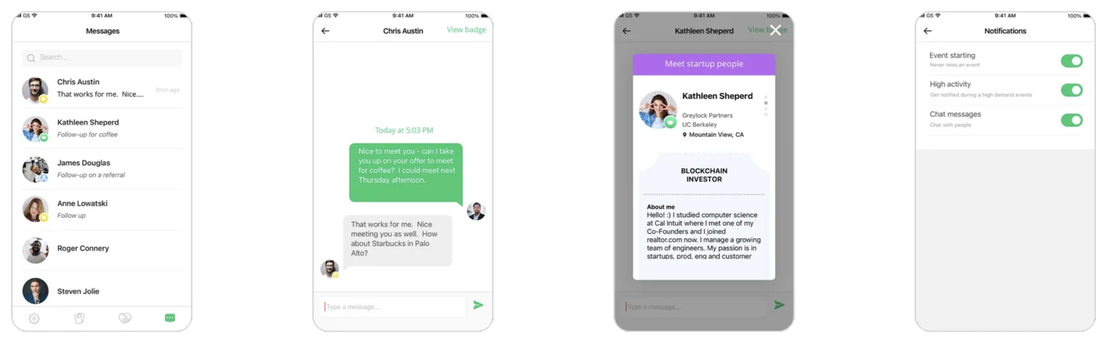
The active call screen.
One screen had to fit live video or audio, the other person's badge, the remaining time, three tag buttons, and a way to end the call and move on. I kept it simple with three decisions:
Fixed 90-second calls
People wanted to meet many contacts quickly. A visible time limit sets the pace, so no controls are needed for it.
Tagging inside the badge
Three buttons on the badge (star, coffee or referral) save a contact to messages. No separate step after the call.
One way out
Ending a call leads straight to the next one.
Decisions and what they cost.
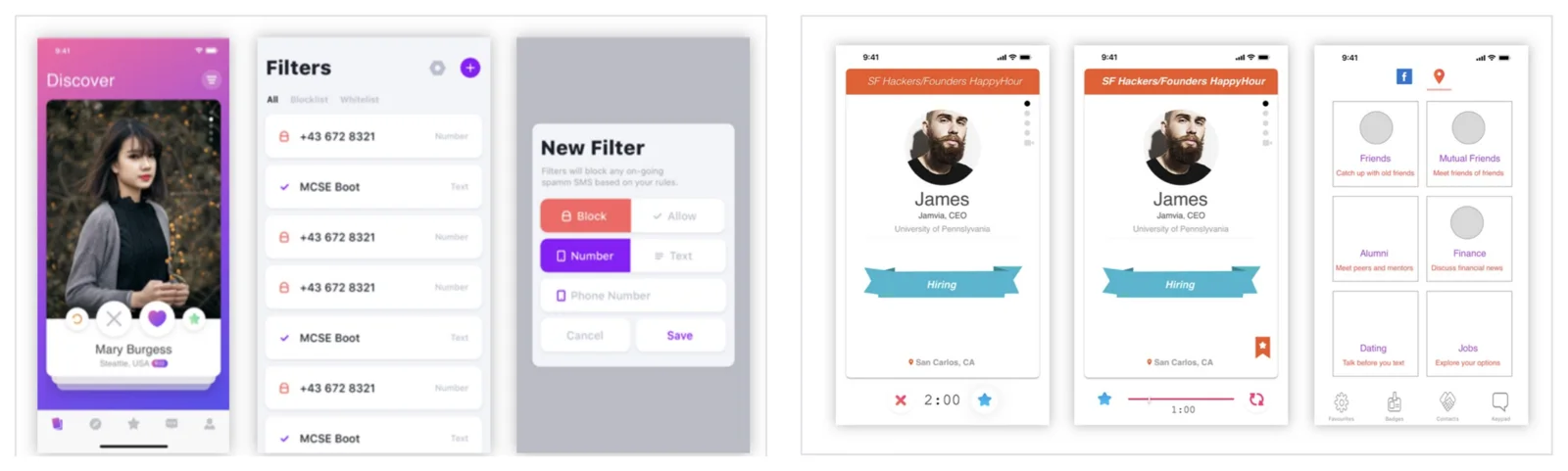
Borrowed dating app patterns
Scrollable badge profiles similar to Bumble and Tinder, so the core interaction felt familiar.
Trade-off: risk of the product reading as a dating app
90-second calls
Matched the goal of meeting many people quickly from home.
Trade-off: less time for deeper conversations
Eventbrite as the only event source
The most practical way to promote live networking events and scan tickets.
Trade-off: dependence on one platform
Facebook login only at launch
Chosen because of technical limits at the time. Email login was planned.
Trade-off: excludes people without Facebook
Badges, calls and following up.
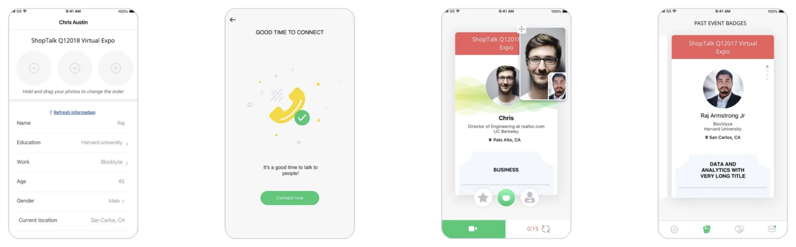
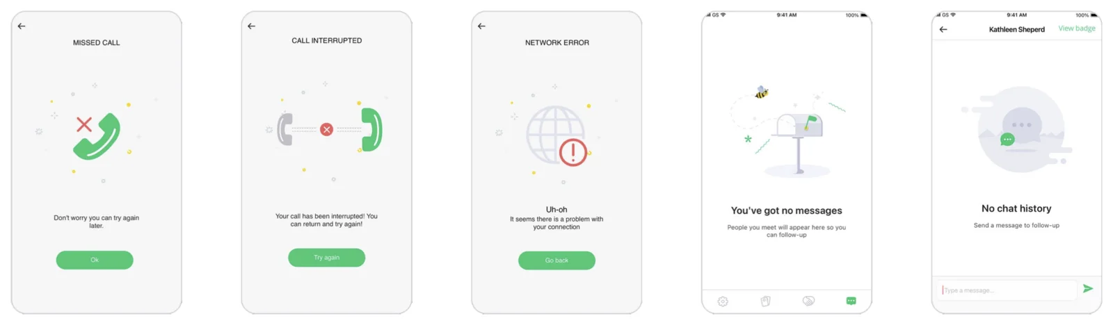
Each event gets its own badge with photos, work, education and a short bio, and every badge is kept, one per event. When an event is busy, a prompt says it's a good time to connect. After the call, contacts show the tag from the call and a suggested follow-up, and the badge opens over the chat as a reminder of who the person is.
Visual system and brand
Options for the name included appy hour, happy hour and event phone. I chose apphour because it's short and easy to remember. The logo is based on the event badge the app creates for each user. Open Sans for legibility at small sizes; outlined icons, filled when active.
Launch and marketing assets.
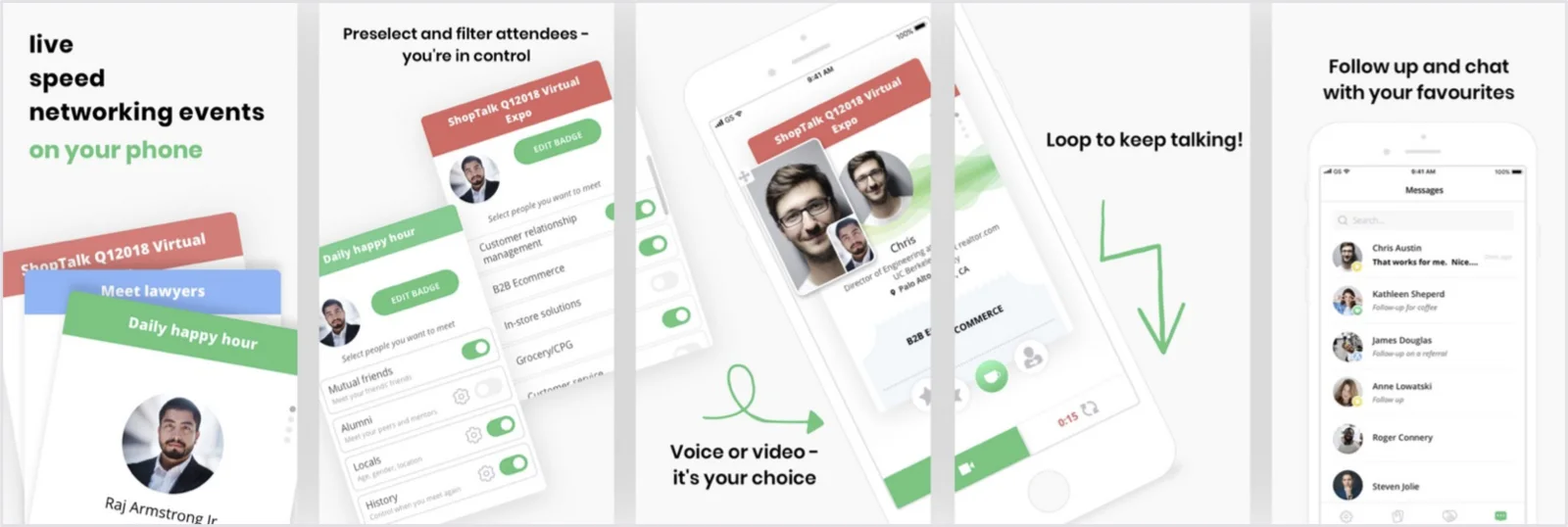
I also made one promo video per event for YouTube and the Eventbrite page, about a minute long, edited in iMovie with app interactions animated in Principle.
What I'd change, and what I learned.
Test with target users
Sessions with friends were fast but not representative of the primary persona.
Agree success measures before launch
Without them it's hard to show what the design changed.
Define the business model earlier
It shapes decisions like the login method and platform dependence.
When a client is unsure what to build, research is the fastest way to get a decision everyone trusts.
Working remotely with a US-based client pushed me out of my comfort zone and helped me grow quickly.
apphour on the App Store ↗Squared →