Euka Creators
From a web app to a native iOS app in six months. The fastest decision was launching before we were ready. The smartest was not building native until we understood why people weren't coming back.
- Project
- Creator monetization, iOS, 2025–2026
- Role
- Product Design Manager, sole product designer
- Team
- PM and engineering. No design manager above me
- Platform
- Progressive web app, then native iOS
- Timeline
- 6 months, web app to native
Held directly
- Product decisions
- User interviews
- Research synthesis
- Navigation and IA
- Onboarding
- UI design
- Design system
- iOS patterns
- Specs and design reviews
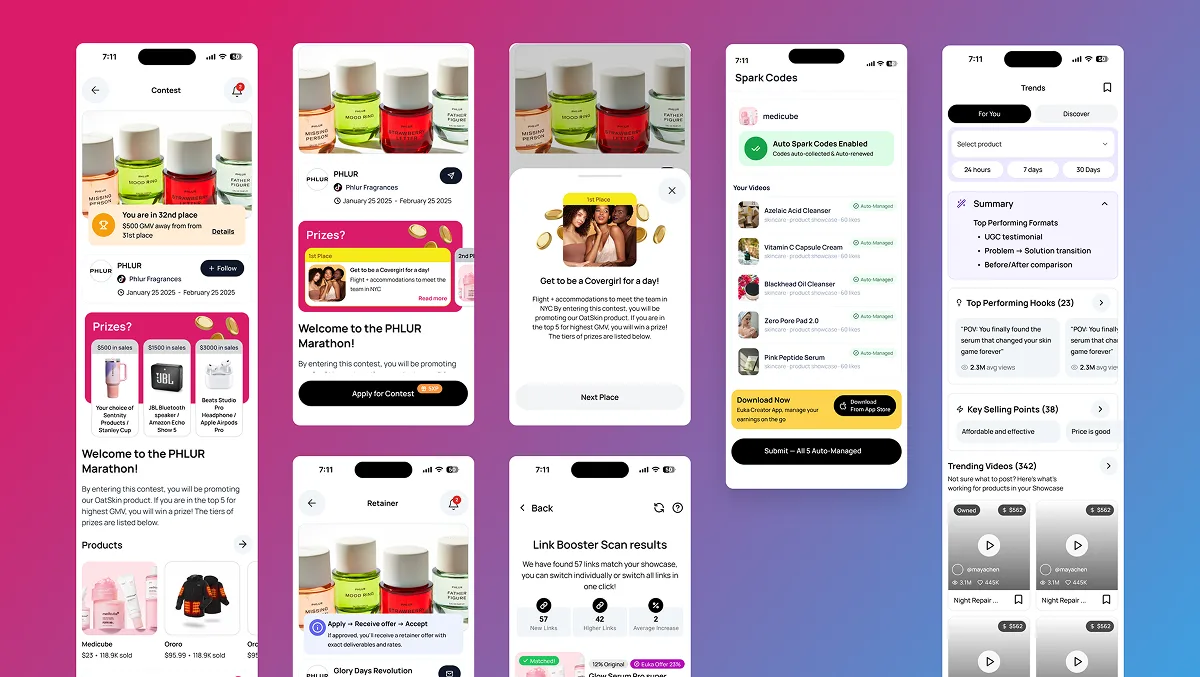
8.8K
First-time downloads, January to April 2026
49.7%
Product page conversion, daily average
6
Months from web app to native iOS
1
Designer on the product
Web app first, native second.
Euka connects creators with brand opportunities: creators browse, apply and manage their work in one place. There was no mobile app when I joined, just a product direction and pressure to move fast. We launched a progressive web app first to get something real to creators quickly and learn from how they used it.
Ship the web app
Functional enough for early adopters, instrumented enough to learn from.
Observe
Interviews with creators and product analytics on real usage.
Build native
Redesign based on what we saw, on top of a design system.
- No native patterns
- Limited engineering time
- No design system
- Shipped unfinished, on purpose
What the data actually said.
Creator interviews
Recruited from Euka's Discord community of 10,000+ creators. Focused on workflows and mobile habits.
Product analytics
PostHog showed where people dropped off, what they couldn't find and which features went unused.
Creators weren't rejecting Euka. They were leaving before they understood it.
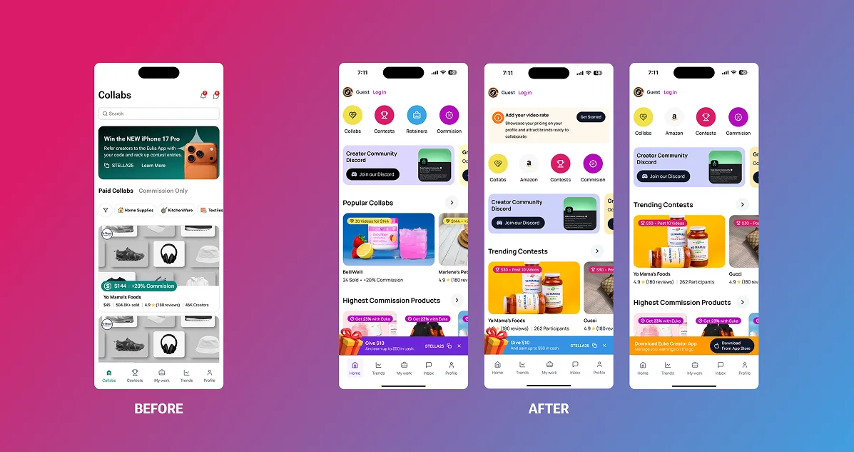
Open browsing before login.
Open app → Sign in → Browse → Apply
Research showed people leaving at the sign-in screen, before they had seen any opportunities.
Open app → Browse → Apply → Sign in
Sign-in moved to the moment a creator wants to apply. Browsing real opportunities first gave creators a reason to create an account.
Building the system first.
Before redesigning any screen, I built a design system. The team preferred to move straight to screens. I pushed back, because visual debt grows fast on a small team with one designer, and creators were already calling out inconsistency. I used Figma Make to turn designs into working prototypes faster.
- Type scale
- Colour tokens
- Buttons
- Inputs
- Cards
- Navigation
Two things I had to argue for
Onboarding
The team wanted to skip it to ship faster. Interviews showed creators landing with no idea what to do, so I made the case with their own words.
Holding the design system
There was steady pressure for one-off fixes outside the system. I said no consistently, because a system only works if it's followed, and consistency was one of the things creators asked for.
Designed for native, not a web app in a native shell.
iOS conventions where they help
Standard patterns where they let creators move faster.
Distinct where it matters
Custom patterns where Euka needed its own character.
Push notifications
Something the web app couldn't do, and creators had asked for.
Native interactions
Designed in from the start.
Final design
Results.
App Store Connect, 10 January to 30 April 2026
24.3K
Impressions
12.1K
Product page views
8.8K
First-time downloads
49.7%
Conversion, daily average
Creators who could browse before signing in had longer first sessions and returned more often, with retention improving by week 5. Average retention (approximate, opt-in users only) was about 30% on day 1, 14% on day 7, 11% on day 14 and 9% on day 28.
Being the only designer in the room.
I made product decisions with PM and engineering, without a design manager to escalate to. I planned, ran and synthesised interviews without a dedicated researcher, and kept engineering and PM aligned through Figma files, written specs and regular design reviews. I moved fast on the web app to learn quickly, and slower on the system and onboarding, where shortcuts would cost more later.
The hardest part of full ownership isn't the craft. It's knowing when to slow down and when to move fast, with no one above you to make that call.
Camp Management Platform Overhaul →